Tweak
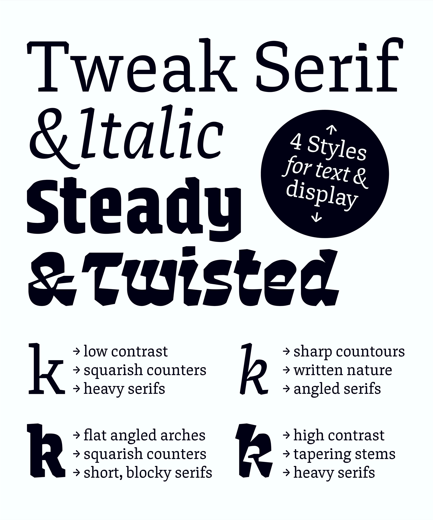
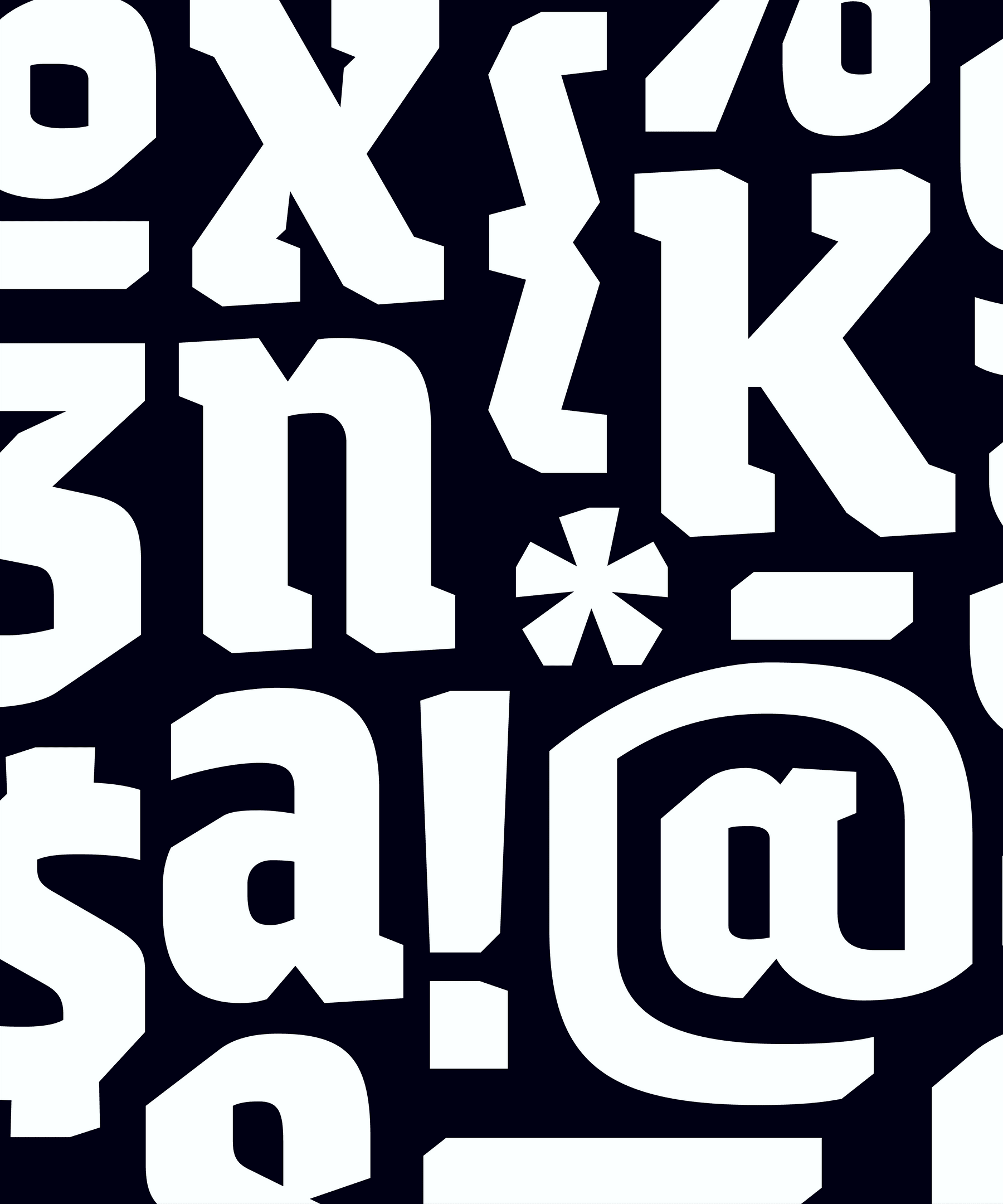
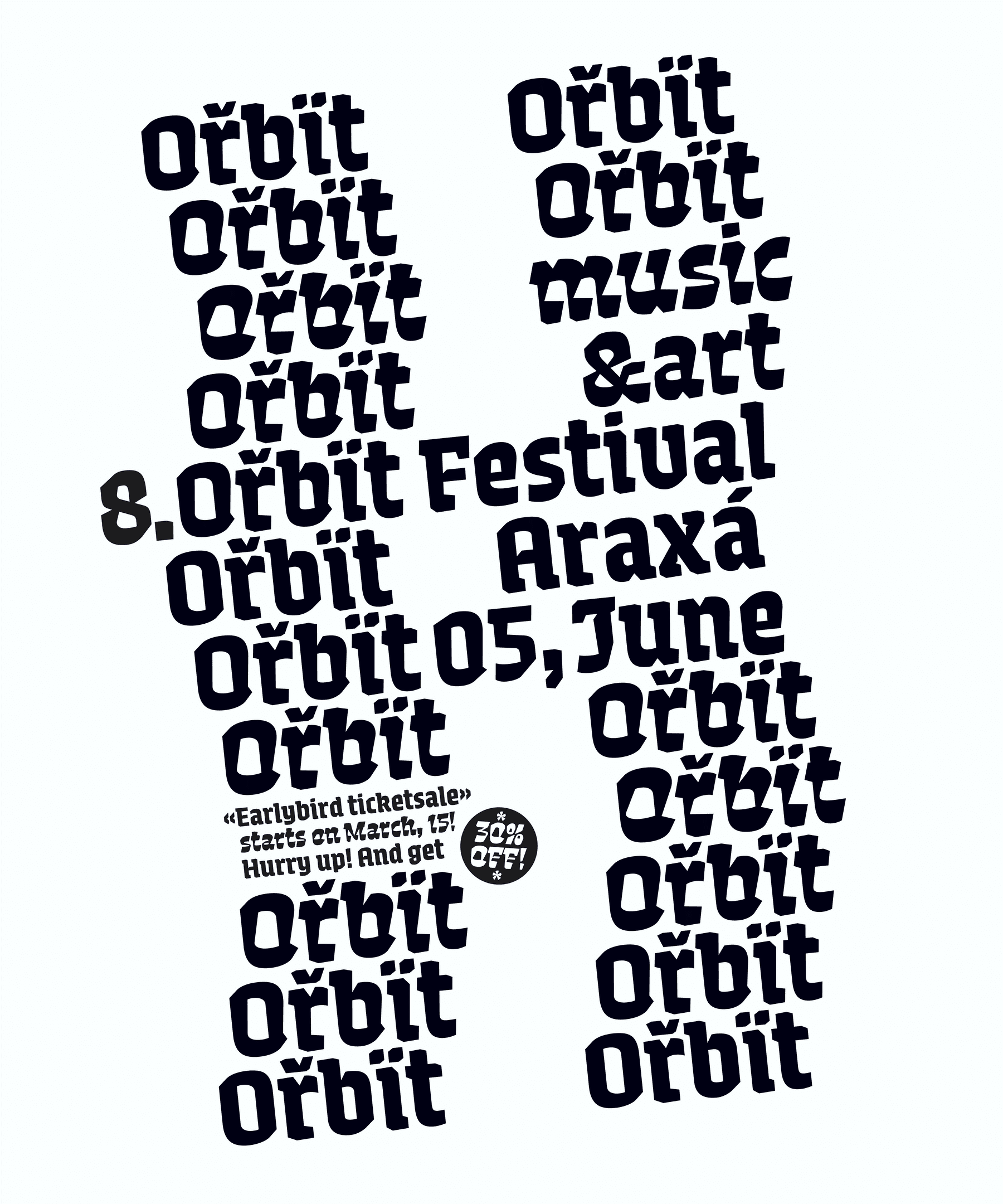
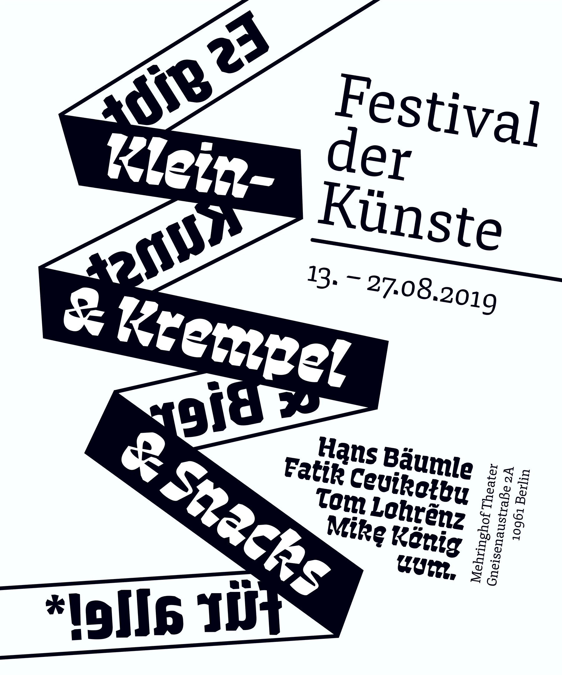
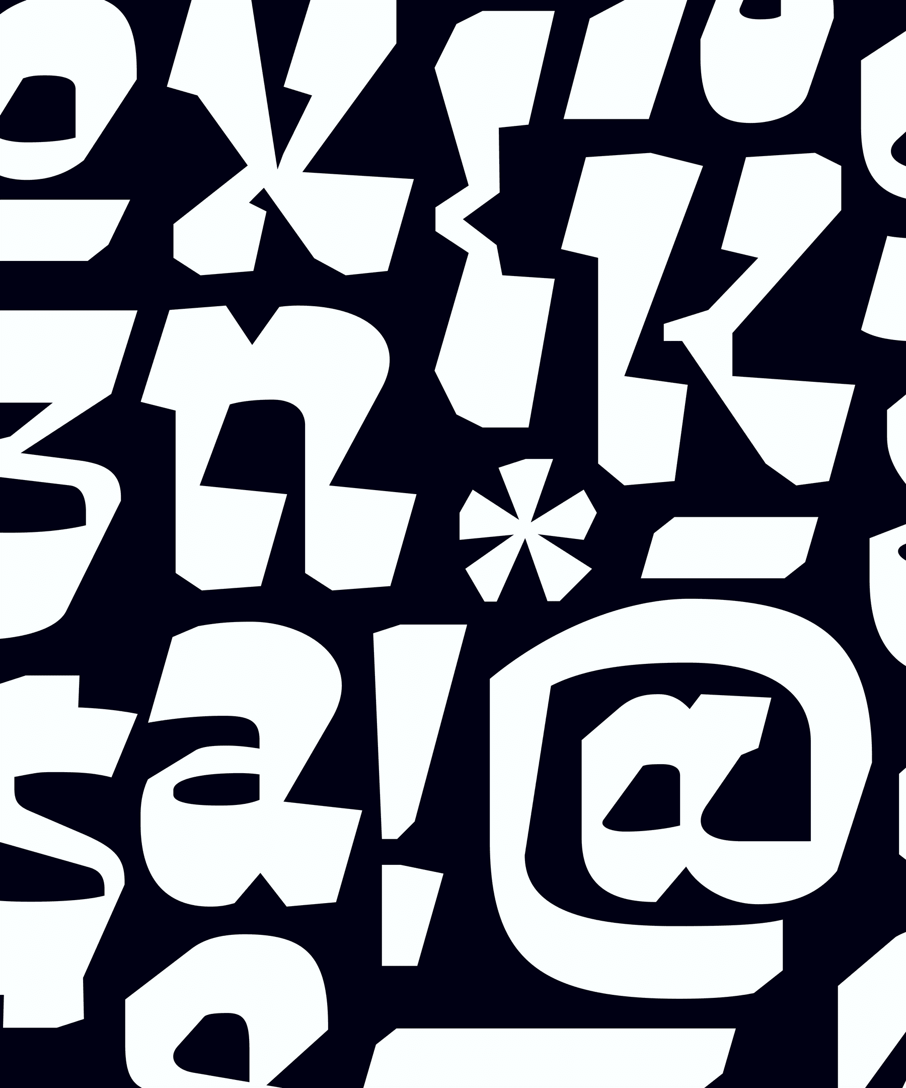
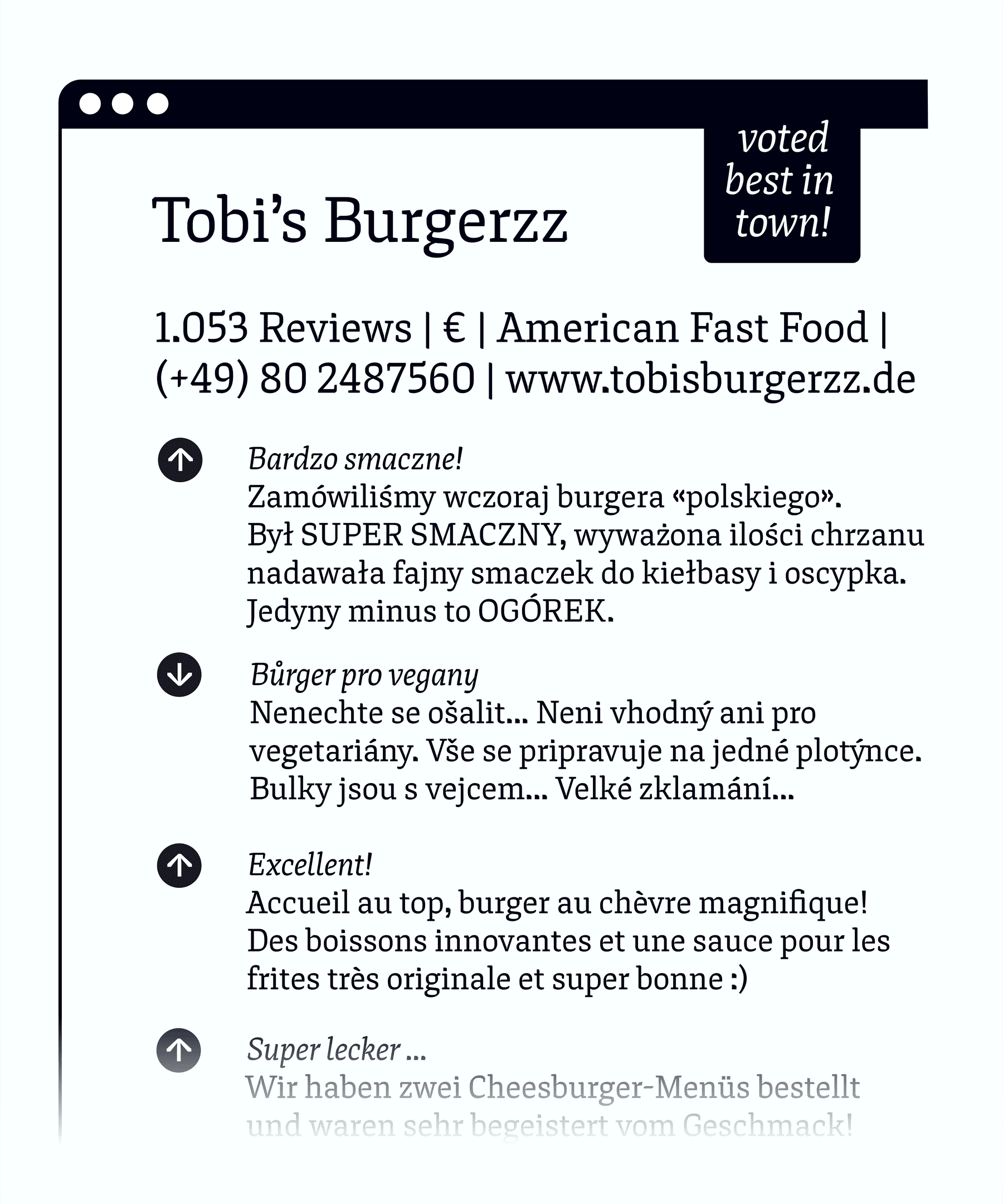
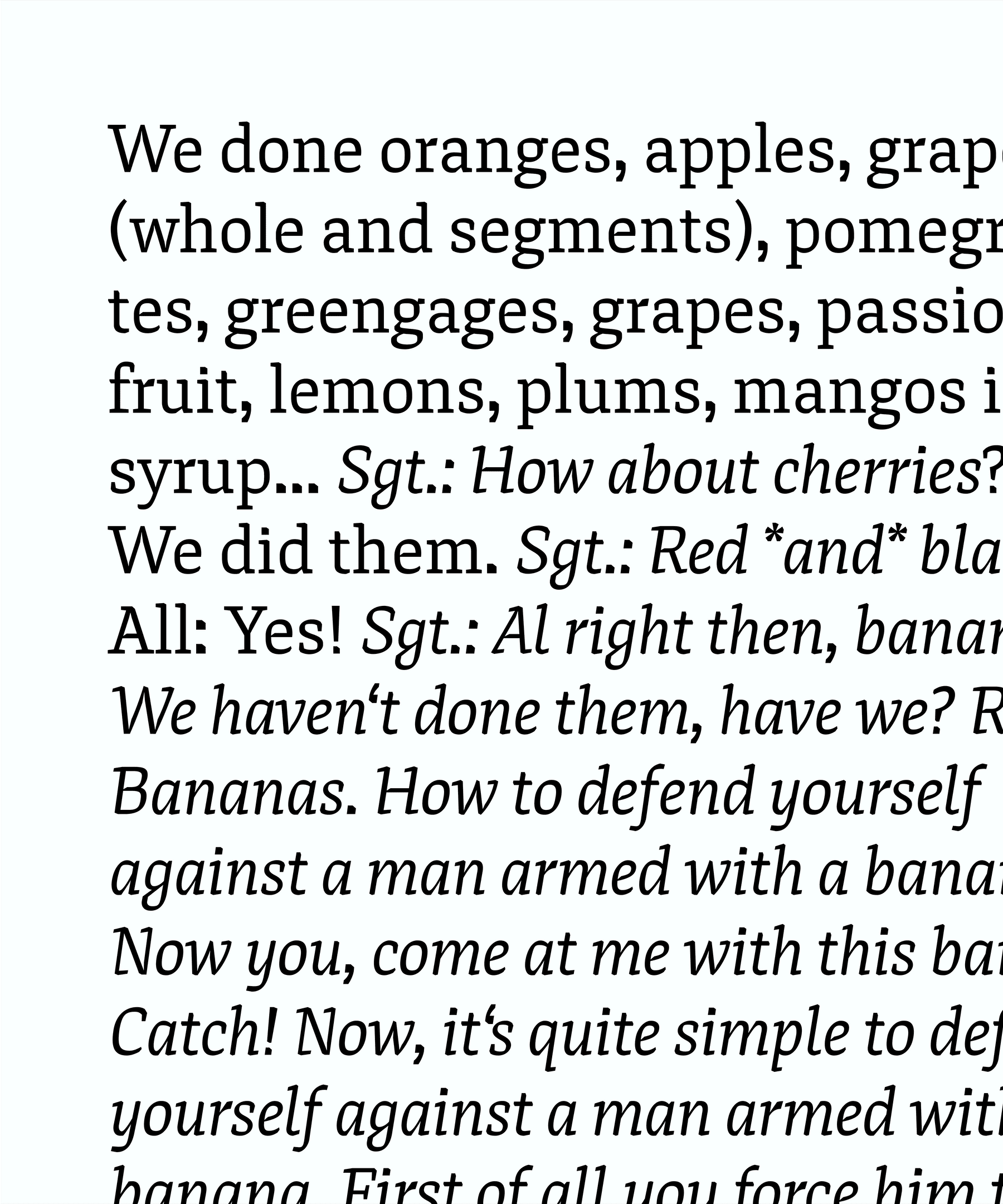
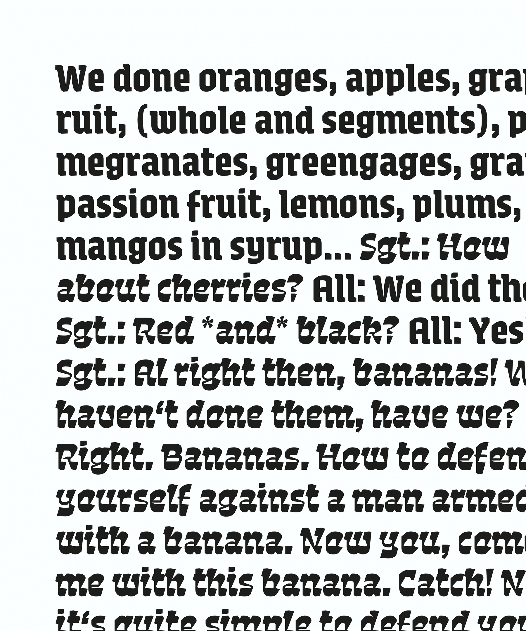
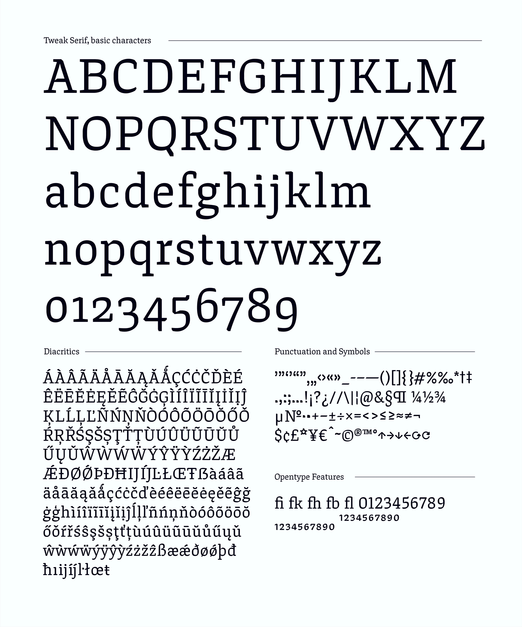
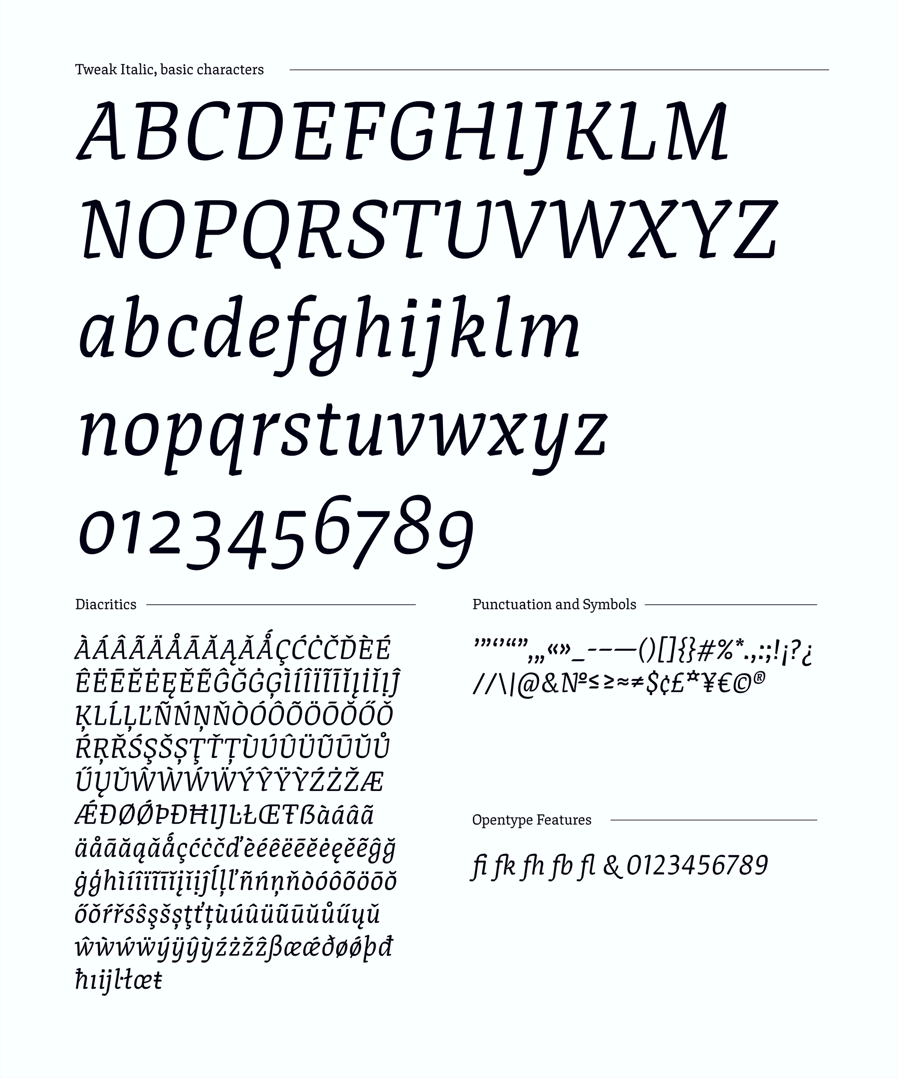
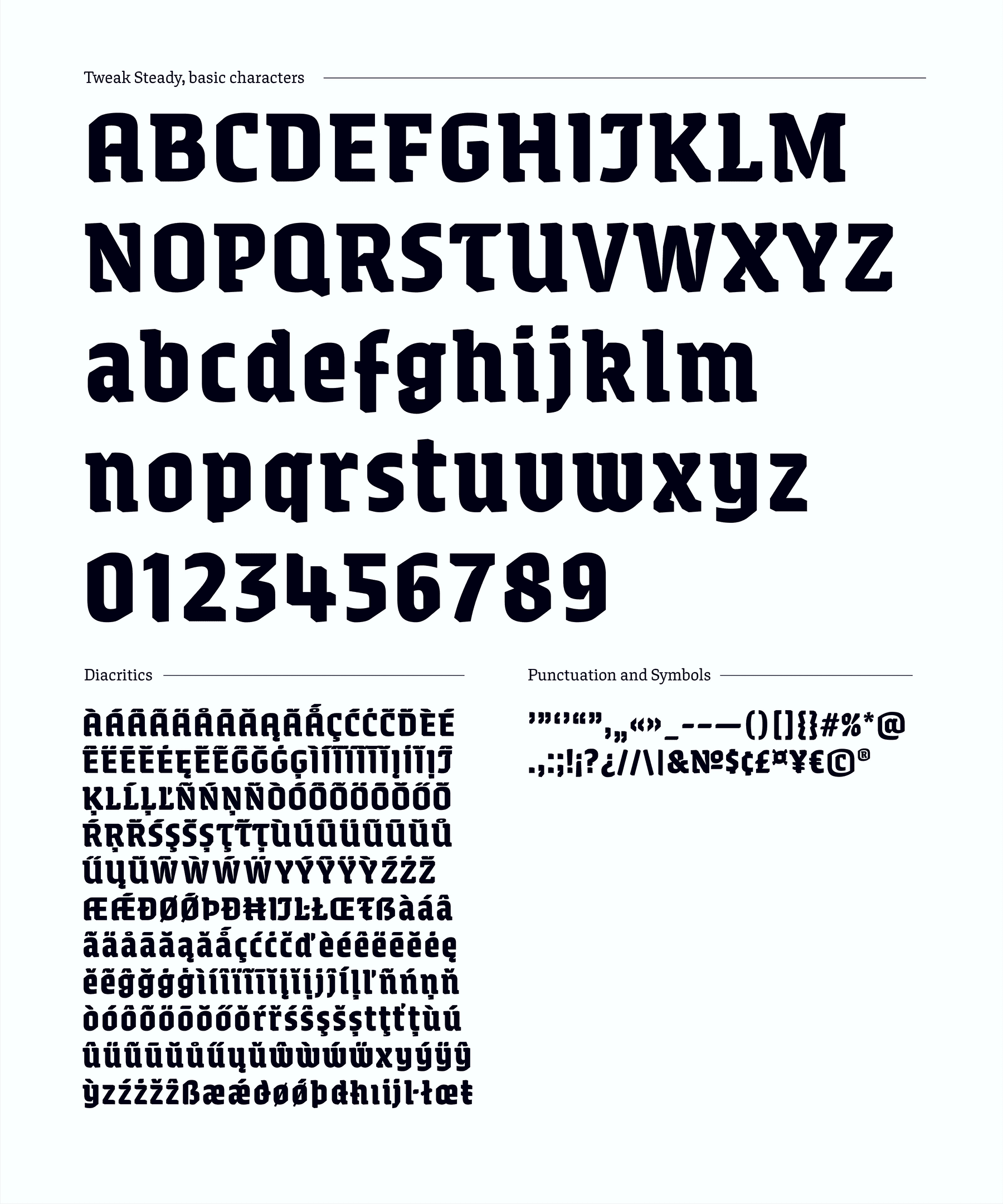
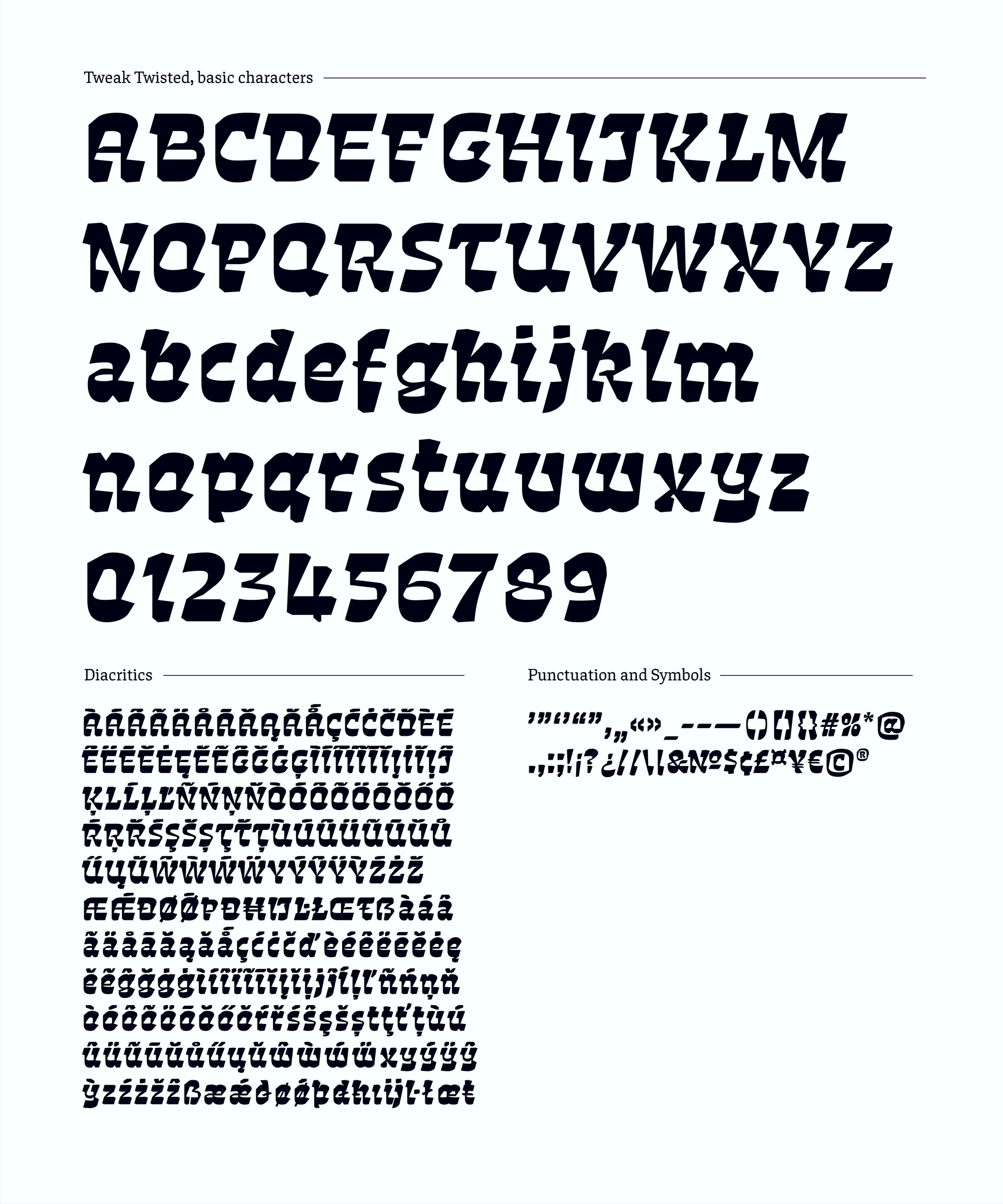
Tweak is a type family with four very diverse members. They are designed to work together in digital environments, where the display style reveals the ability to change appearance. The text styles, Tweak Serif and Italic, with their squarish counters and sharp appearance, create a consistent rhythm and simplify reading of running text on screen. The display style is a variable font and contains two stylistically different extremes, Tweak Steady and Twisted. It is playing with the idea of contradiction and can be used for animations. With its short ascenders, descenders and compact appearance the display style allows a compact setting of lines. Tweak was released with Future Fonts in October 2018 and will be developed further.
Katja Schimmel
GermanyAfter experimenting with lettering, calligraphy, and different materials during her studies at Bauhaus University Weimar, Katja set her focus on type design and received a masters degree from TypeMedia in The Hague. Since graduation she decided to expand her education by learning about font production, engineering and scripting during an internship at Alphabet-Type, in Berlin. Now she works as an independent type designer.

Process Notes
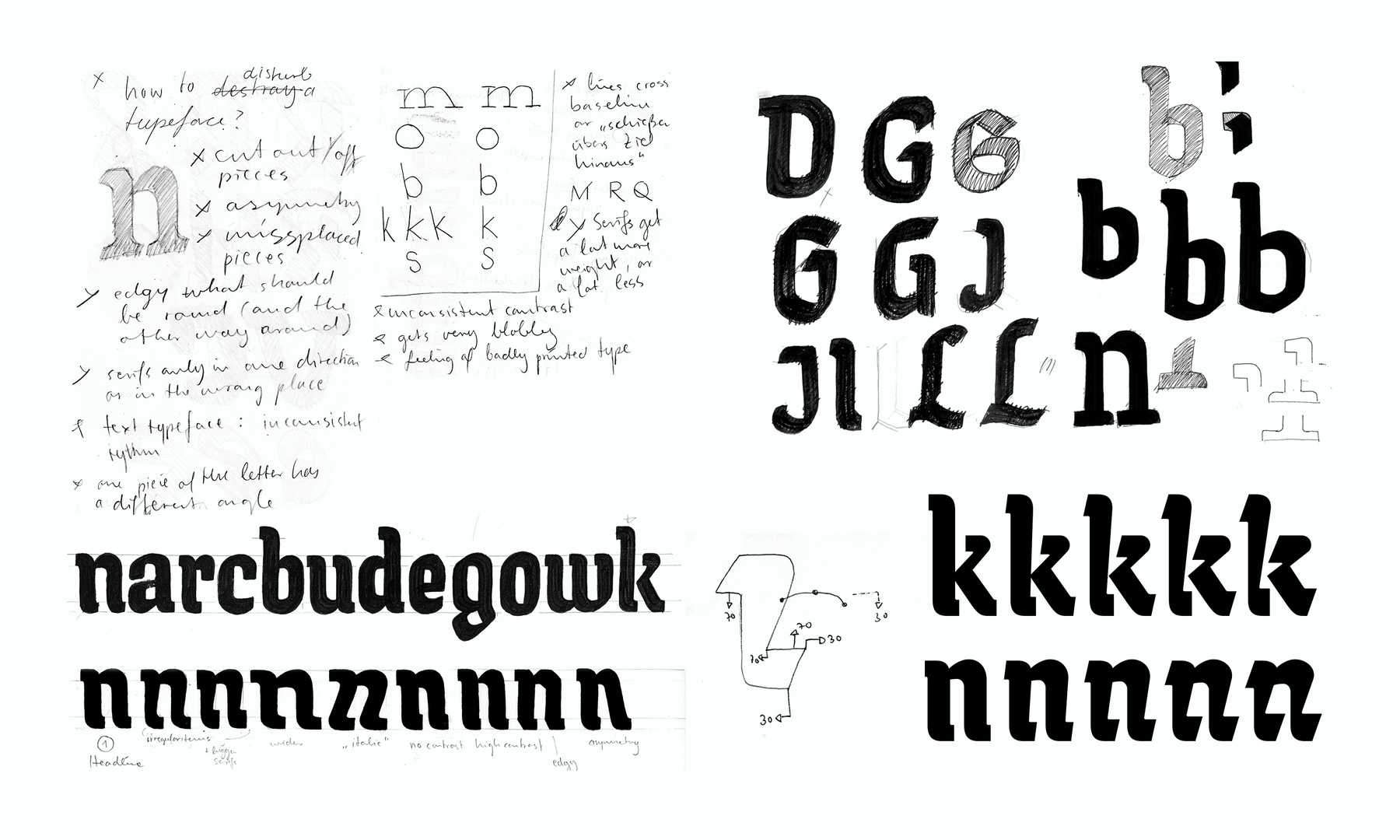
The project started with the idea to learn more about the production of variable fonts and to create a typeface that plays with contradiction. I wanted to design a versatile typefamily for digital environments and animations. So, in my first sketches I explored shapes and experimented with ways to distort the outline of letters. I digitised those shapes and translated the distortion into an interpolation axis. I came up with an algorithm that describes the movement of contour points from one end of the interpolation axis to the other and thus the emergence of a shape shifting letter.
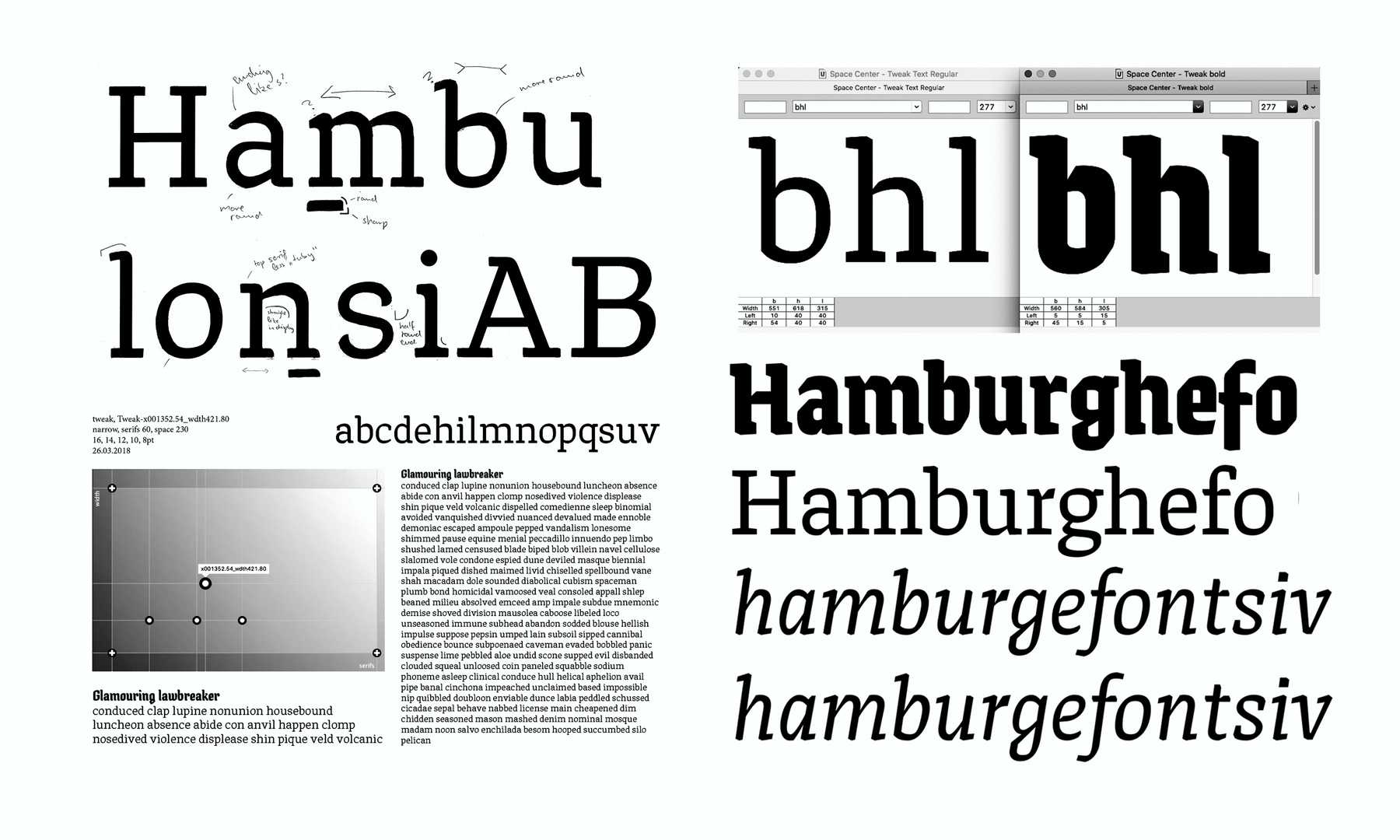
Additional to the variable display style I started working on text styles, which are intended to be used in body text on the web or in apps. First and important step was to find out the relation between text and display style. Which design elements are unnecessary in the text style and what design decisions improve readability on screen.
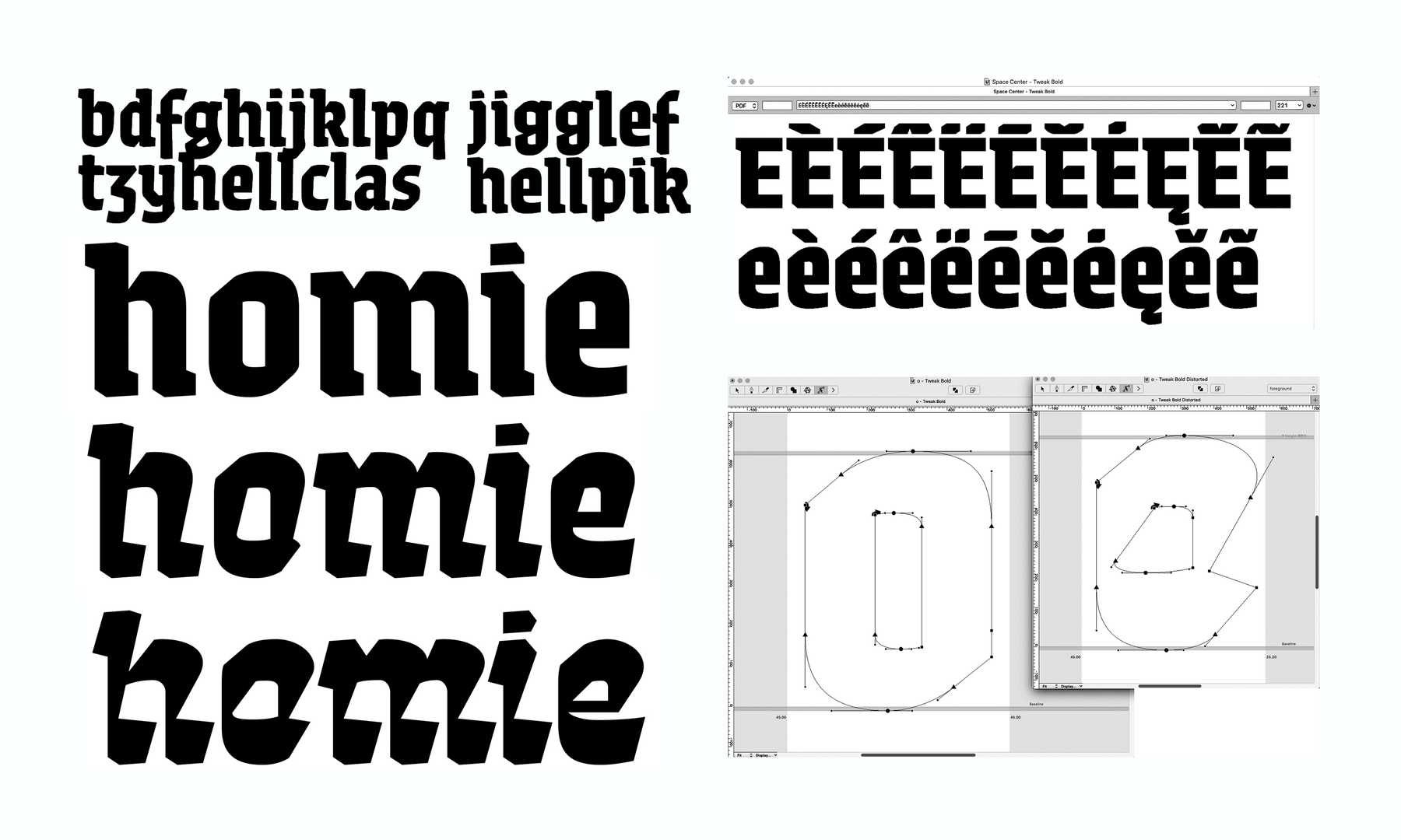
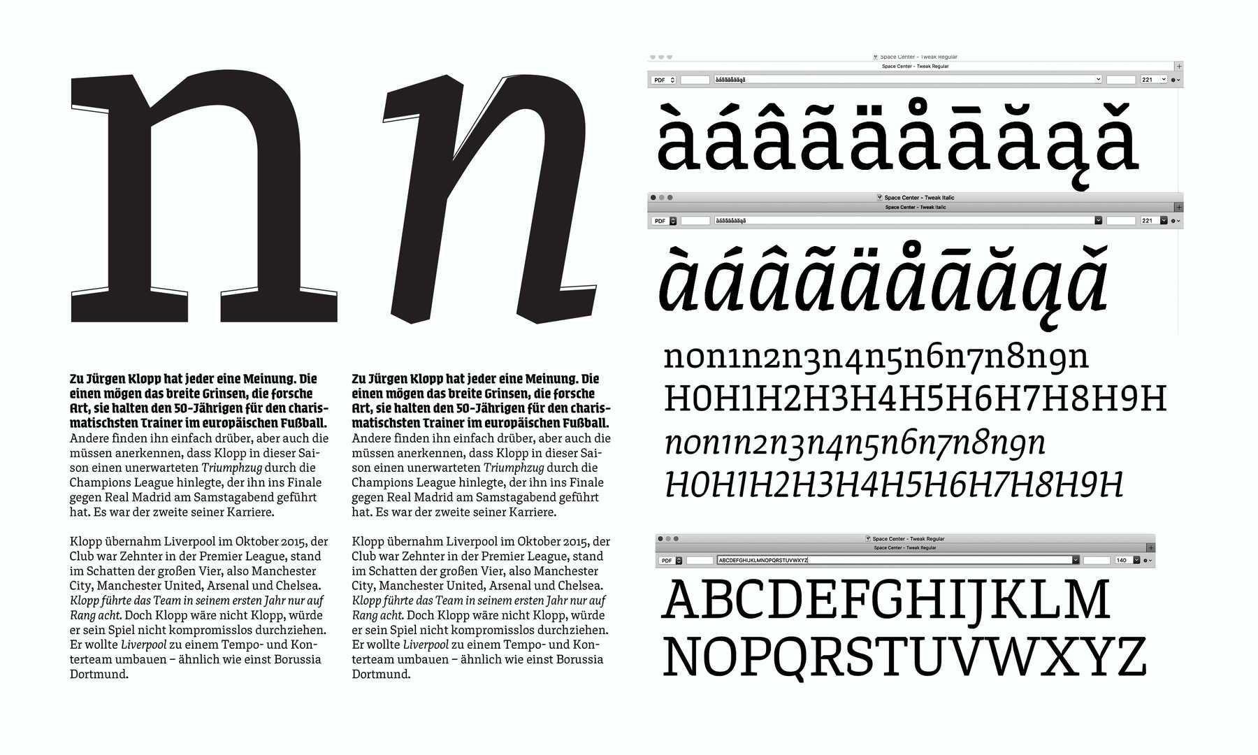
To always keep an eye over the whole family, I switched back and forth working on the display and text style. Figuring out the interpolation between the two display styles “Twisted” and “Steady”, involved a lot of experimenting with the shapes itself. To review my decisions, I started to work on a testing environment in the browser, to see how the variable font would animate and the text styles behave with different px-sizes and line-length. Main issues were the consistency of the movement in the display style, the depiction of running text with the text styles and fitting diacritics for the intended use with a narrow line height.
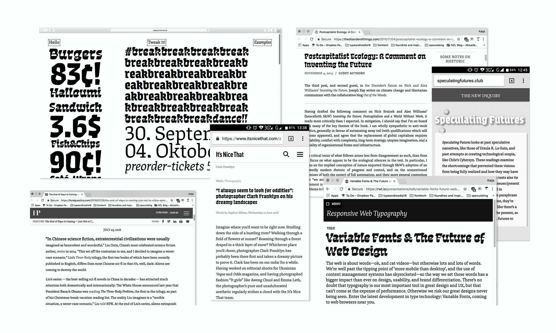
Testing of the typefamily on different websites and mobile devices, was crucial for the development of the project. It was the best way to figure out issues and work on readability, as well as develop a new set of skills. For the presentation at the end of the semester I was able to design a website for Tweak, using CSS and HTML. The Mini-Side introduces the project, shows examples of use and includes a type tester.